Front Cover Draft 1:
In the first draft what I started doing was making adding more scenery to the background because the actual picture I took wasn't wide enough to take place on the whole cover. So what I had to do was edit the background by copying parts of the scenery in to help extend the picture so it can fit onto the back cover. At this stage I only filled hall the right side because I had to do the bottom side with more precaution because editing would take more longer that the top part. But the the extended background doesn't need to be really perfect as it's going going to be covered by the tracklist.
Front Cover Draft 2:
This draft is the finished extended version of the background for the back cover. As you can see it looks like thats the actual photo taken except from some areas where you can notice it has been edited. But these parts doesn't matter because the audience won't see them anyways. This took me a while to do because the bottom area was much more difficult than the top part due to the fact I had zoom in and copy part for part to make sure it looked almost the same. I am really please at the outcome because my group were really impressed with my work and complimented me for spending good careful time on in.
Back Cover Draft 3:
For this third draft, I used an effect which was mainly the 'blur' effect. I wanted to make the artist stand out in the frame so I blurred out the background in order to get all attention on the artist which shows to be very effective because now when the the track list appears the artist will also stand out from it. Another reason I used the blur effect was because I had to extend the image and I didn't want to show the edited part because it wasn't clear, you could tell it was edited and I didn't want the audience seeing this so what I did was blur the background so they can't notice it. Although, you could still tell a little, that downs t matter because like I previously stated those areas will be covered.
Back Cover Draft 4:
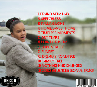
This is the draft where I first added the album track list which is in the same colour and font as the artist's name on the font cover. I placed the album track list on the blurred section because I didn't want people seeing the edited areas of the background. The reason why I placed it on the right side was because 2 out of the 3 artist's from my digipak research placed their track list on the right side so I thought I should used this common convention because partly of the fact the right section on this image is blurred and because it's been used by many popular artist which allowed my decision to be easier to decide what side to choose.
Back Cover Draft 5:
The fifth draft is when I added the record labels logo which is 'Decca Records'. I placed the logo on the bottom left because of the common conventions I looked at my digipak research and 2 out of the 3 artist's digipak place the record label logo on the bottom left of the cover. By seeing the conventions I decided to use this convention because of the fact it's more common to place it on the record label logo on the bottom left, as it prevues to be effective.
Back Cover Draft 6:
After adding the record label logo, I then added the bar code of the the digipak. Again from looking at my research 2 out of the 3 artists placed the bar code on the bottom right of the cover. I dues this because it was the common convention ad because of my back ground. The fact I blurred that area of the cover but you can still notice that it has been edited, I wanted to cover it because I didn't want the audience to see it as it doesn't look very professional and it will not look very appealing
Back Cover Draft 7:
In this draft I was just chaining up the font and the colour of it just to see how it looked. As you can see the pink colour doesn't stand out and the font looks to simple which doesn't give this a very good look. The reason I chose the colour pink was because 2 out the 3 digipak used the colour pink for the font so I thought I would use this but from feedback from my group it didn't look good and didn't feel right as the rest of the digipak use the colour red with the same font.
Back Cover Final (Draft 8):


No comments:
Post a Comment