Wednesday 13 November 2013

Digipak - Spine

For the Spine I wanted to keep it simple and make it fit in well with the rest of the digipak by using colours that have been used throughout the digipak.

Spine Draft 1:


For the first draft I made the base colour black because if I wanted the spine to fit right in with the rest of the digipak then I had put the best base colour that can go well with the other colours used throughout the digipak. These colours being red and white.


Spine Draft 2:

For the second draft I added the artist's name and the album name which was 'Kirstie Mayweather' and 'Timeless Moments'. I used the same font as the front and back cover for both names and I used the same colour that each name had on the front cover. So for 'Kirstie Mayweather' I used the colour red which proved to be a good choice because it shows the difference in the spine and the colour red separates the name in the colour white. The album name is in the colour white which again is used in the front cover and again it helps separate the names from each other. Also, with the black base you can see each name clearly. Furthermore, I wrote the names going down the spine instead of making it in side ways because from my research the artists wrote both names sideways but I challenged this convention because I believe for my digipak both names look better going down and it also looks more clearer to read and easier to read as you don't have to have turn the digipak flat in order to read both names.
Spine Final (Draft 3):


For the last draft and final spine I added the record label's logo because from my research I noticed that the convention used was to put the artist's record label on the spine so I used this convention and put my artist's record label on the spine because it does give it a more professional look and I felt like I was giving the spine its finishing touch by adding the logo.

Tuesday 12 November 2013

Digipak - Extra Panel New

For the Extra Panel I used a image of our artist 'Kirstie Mayweather' because like previously stated this album is all about her and so I wanted more panels of her in different outfits rather than having the same outfit throughout the digipak. As explained before, the reason for this is because in the inside panels it can show the artist in a different way such as in the panel she is represented as classy and smart. Also, because we wanted to represent our artist as 'classy' and 'sophisticated' I assumed this photo of her would be good to use because in this photo our artist is all dressed up and giving her audience a pose. But in this image there is a red chair where our artist is sitting on and giving a pose at the same time. The red chair is key because throughout the digipak the colours black and red have been used many times such as in the front and back cover, on the CD and on the spine. So putting the red chair in the image, helps link all the images together by keeping the same colours that have used before and by putting them in other parts of the digipak on different panels to keep that consistency of colours used. Also, she is wearing the same black dress from the left panel and I did this because it's good to show different outfits from the front and back cover but again it is also good to keep some of the mise en scene which in this case is her costume/outfit the same in some parts throughout the digipak.

Extra Panel Draft 1:

Like the left panel, the first draft is the actual photo taken and I had to decide how I was going to place her on a square sized panel by either using the 'Crop' tool or by re-sizing it for it to fit the panel because of the fact the image is a portrait orientated image.

Extra Panel Draft 2:

For the second draft, just like for the left panel I used the 'Crop' tool by taking away the bottom part of the photo. I then placed the photo on the left side of the panel because of the her positioning/pose in the photo and the way she's looking more towards the right, made it easier for me to decide to frame her on the left side. Placing her on the left side looked better than placing her on the right side due to her body position.

Extra Panel Draft 3:

In the third draft, I changed the way I placed the photo of the artist because I didn't fill the whole Panel and I tried to extend the background but because of the red chair and our artists arm it was very difficult to extend, therefore, I had to re-size the photo by making it bigger in order to fill the frame. What I also did was position her more towards the left as I discovered before, it looks better on that side and because of the way the digipak will open as this is the left panel it would fit it in well with the rest of the digipak. I added the blur effect on the right side of the panel because I needed to add the signature of 'Kirstie Mayweather' and to see it clearly, I had to put the blur effect on. I placed the signature on the top right side of the image.

Extra Panel Final (Draft 4):

For the final draft I made the background from white to black because when I entered the signature of our artist the font was white and so was the background which meant you couldn't see the whole signature. So I changed the background colour which was better than changing the font to black because the background now goes which the rest of the digipak but also with the black dress used in the image. Having a white colour font for the signature on a background goes well together and I wanted to use more white in this digipak so this is why the colour was white.

Digipak - Extra Panel

For the Extra Panel I used a image of the house with the sun shining in the middle and branches from a tree entering the frame because it is a well taken photo and because this is an extra panel so I thought an image of the sun shining can fit in well with the other pictures. This is because with the extra panel it can be anything that can link in with the rest of the pictures. So I put in this picture of the sun shining because it adds something different to the digipak because of the change in scenery. I wanted to add a unique feature in this digipak and thought this image would be perfect to demonstrate that.

Extra Panel Draft 1:

What I like most about this image is the red dots that that are reflected onto the camera because it gives the image a good effect, almost like a summer effect. Also the red dots link the image well with the rest of the digipak because of the fact of the red coloured writing used in the artist name in the front cover and the tracklist in the back cover.

Extra Panel Final (Draft 2):

This image looks the same as the draft 1 and for some reason it doesn't show how the image actually looks but on Adobe Photoshop it looks more smoother and you can see the trees in more detail to bring them out from white sky background.

Monday 11 November 2013

Digipak - Right Panel New

For the Right Panel I chose to put a photo of our artist 'Kirstie Mayweather' because this album is all about her and so I wanted more panels of her in different outfits rather than having the same outfit throughout the digipak. The reason for this is because in the inside panels it can show the artist in a different way such as in the panel she is represented as classy with the black and white effect and into her music with the piano and head gear. Also, because we wanted to represent our artist as 'classy' and 'sophisticated' I assumed this photo of her working in the studio would be good to use because in this photo she is in wearing casual clothes doing her job instead of what some of the other other photos showed which was being all dressed up and giving her audience a pose.


Right Panel Draft 1:

The first draft is the actual photo taken with no effect and this image had to be re-sized a little as it's a bit too wide for the square size panel.

Right Panel Draft 2:

For the second draft, the image has been resized to a square and I made the photo black and white because from my digipak research, 1 digipak had the black and white effect which looked effecting so I wanted to develop this convention by putting one image in the digipak black and white. The reason why I chose the image of her in the studio working instead of the, for example, the front cover was because this image proved to be most effective in black and white and because the main colours of the digipak was black, red and white, I knew it link in well with the rest of the digipak which benefited me as it was good and effective choice.

Right Panel Final (Draft 3):

In the final draft, I added another effect which was circle affect on all the edges. The effect makes the image focus more on the artist and the mise en scene because of the way it only allows the audience to see them only as the edges are blacked out. I used this effect because it adds a nice feature towards the digipak but also the image itself.

Digipak - Right Panel

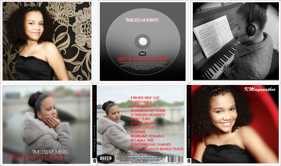
For the Right Panel I chose to put a photo of Putney Pier which is also one of our filming locations because in the front and back cover our artist is on the pier and I know this image will link well with other images because it's the same location of the other images which allows it to fit in well. Also, because this is the right panel and you see the pathway on the right with half the bridge cut of on the left side, it fits in well in the way the scenery is set out as this image is going to be on the right side (panel) when you open the digipak. What I wanted to do was to make the bridge look as if it was going to be connected by using two images of the of the pier on the right and left panel from the digipak.

Right Panel Draft 1 (Final):


For the first draft the effects I used was to make the image more cleaner, sharper and smoother because it gives the image a better look which makes the image more easier to slot in well with the rest of the digipak.

Right Panel Final? (Draft 2):

In the second draft I put on a effect on the image which makes it look like it has been painted or drawn because for the inside panels I wanted to change it up a bit as it's not images of the artist, I wanted to add something extra to the digipak by giving this image an effect to make it look more unique and to mix it up a bit with adding effects to some images of the digipak. But on the other hand it may not look good with some edited images so after careful consideration and discussions my group I'm going to be keep the image simple with no big effects and so I'm making draft one the right panel of the digipak.

Friday 8 November 2013

Digipak - Left Panel New

For the Left Panel I chose to put a photo of our artist 'Kirstie Mayweather' because this album is all about her and so I wanted more panels of her in different outfits rather than having the same outfit throughout the digipak. The reason for this is because in the inside panels it can show the artist in a different way such as in the panel she is represented as classy and smart. Also, because we wanted to represent our artist as 'classy' and 'sophisticated' I assumed this photo of her would be good to use because in this photo our artist is all dressed up and giving her audience a pose. From my research of digipaks of pop artists, the common convention is that they are wearing a black dress/outfit in the front and back cover but I developed this by putting images of her in a black dress/outfit in the inside panels because I wanted to show to her audience the many different sides she has. Furthermore, the reason this image isn't the front cover or the back cover is because the two chosen images for them link so well in where the location of each images are taken, this image would not go well with either image as from my digipak research the convention was that the front and back cover where in the same location and the artist was in the same outfit.

Left Panel Draft 1:

The first draft is the actual photo taken and I had to decide how I was going to place her on a square sized panel by either using the 'Crop' tool or by re-sizing it for it to fit the panel because of the fact the image is a portrait orientated image.

Left Panel Draft 2:

For the second draft, I used the 'Crop' tool by taking away the bottom part of the photo. I then placed the photo on the left side of the panel because of the her positioning/pose in the photo and the way she's looking more towards the right, made it easier for me to decide to frame her on the left side. Placing her on the left side looked better than placing her on the right side due to her body position.

Left Panel Final (Draft 3):

For the final draft I changed the way I placed the photo of the artist because I didn't fill the whole Panel and I tried to extend the background but because of the patten on the wall behind it was very difficult which meant that I had to re-size the photo by making it bigger in order to fill the frame. What I also did was position her more towards the left as I discovered before, it looks better on that side and because of the way the digipak will open as this is the left panel it would fit it in well with the rest of the digipak.

Digipak - Left Panel

For the Left Panel I chose to put a photo of Putney Pier which is also one of our filming locations because in the front and back cover our artist is on the pier and I know this image will link well with other images because it's the same location of the other images which allows it to fit in well. Also, because this is the left panel and you see the pathway/barrier of the pier on the left with half the bridge cut of on the right side, it fits in well in the way the scenery is set out as this image is going to be on the left side (panel) when you open the digipak. What I wanted to do was to make the bridge look as if it was going to be connected by using two images of the of the pier from the right and left panel of the digipak.

Left Panel Draft 1 (Final):


For the first draft the effects I used was to make the image more cleaner, sharper and smoother because it gives the image a better look which makes the image more easier to slot in well with the rest of the digipak.

Left Panel Final? (Draft 2):


In the second draft I put on a effect on the image which makes it look like it has been water painted on because for the inside panels I wanted to change it up a bit as it's not images of the artist, I wanted to add something extra to the digipak by giving this image an effect to make it look more unique and to mix it up a bit with adding effects to some images of the digipak. But on the other hand it may not look good with some edited images so after careful consideration and discussions my group I'm going to be keep the image simple with no big effects and so I'm making draft one the left panel of the digipak.

Thursday 7 November 2013

Digipak - CD Cover

For the CD Cover I wanted to make it plain because from my digipak research nearly all of the CD's were in plain colour except for one which had a plain background along with simple thick lines filling half the CD. So I used the common convention which was to just a simple background layer but I also wanted to develop it for the final product so instead of just having a simple background, I added a fade which shows the development I made to give it a more unique look.

CD Cover Draft 1:


In the first draft I made the shape of the CD and to start off with I added the base colour that is around the CD which is dark grey because I wanted to keep colours simple and go well with the rest of colours that are used in the digipak. The colour grey helped me as a guide of where the actual will be. Another colour I used was the colour black for the actual CD and this plain colour was temporary as I was planning to change it into a fade. But I used this black colour to help me place where the artist's name and album name will go and what colours will be used on them.

CD Cover Draft 2:


In the second draft I added the name of our artist called 'Kirstie Mayweather'. Like I used on front cover, the font is the same as the one in the front cover and I have used the same colour of the name, which is also the same as the front cover. The reason being from my research 2 out of the 3 digipaks used the same font and colour on their CD from their front cover, which means I used this convention because if its commonly used then it means its better to do this because it keeps it all linked which makes it look more professional. On the other hand, I challenged a convention I researched which was placing the name of the artist on the bottom instead of the top. I did this because in the front cover the name of the artist is below the album name and so I wanted to keep it that way because our album name looks better to be on top in a smaller size where it stands out instead of it being on the bottom where as it will take the place of the artist's name which is placed in between the fade of the two colours will be.

CD Cover Draft 3:


In the third draft I added the album name called 'Timeless Moments'. Like I used on front cover, the font is the same as the one in the front cover and I have used the same colour of the name, which is also the same as the front cover. The reason being from my research 2 out of the 3 digipaks used the same font and colour on their CD from their front cover, which means I used this convention because if its commonly used then it means its better to do this because it keeps it all linked which makes it look more professional. Although, like I previously stated I challenged another convention by placing the album name on top because the way planned the fade I need the album on top as it won't look right the name of the artist on top.

CD Cover Draft 4:


This is the forth draft where I added inner glows to both artist and album name because I wanted to make them look bold and stand out make it look eye-catching and appealing to the audience.

CD Cover Draft 5:


On the fifth draft I added the centre circle in order to make it look more like a CD. I made sure this circle placed exactly in the middle of the CD so the CD doesn't look weird as it is easy to notice when the circle is not exactly in the centre which can make it look less professional. I wanted to make it look professional to the best of my abilities.

CD Cover Draft 6:


In this draft I added the fade on the CD which I previously stated and also I changed the base colour to a fade and to a lighter grey on top with the black fade so it links well with the CD. The CD colour has changed from black to a light grey along with a black bottom which is faded in. The reason behind this fade is because in order to keep the red colour for the artist's name I need to bring black into the CD because when I added the red to the grey it didn't go well together so I thought bringing in a fade will change this and from looking at the image of the CD cover, its shows that this was the right choice. Furthermore, I took off the inner glow for the artist's name because it looks better without it with fade in the background but I decided to keep the inner glow on the album name as it make its stand out on the CD.


CD Cover Draft 7:

For this draft I added the 'Decca Records' logo and placed it in the centre of CD on top of the artist's name. I put the logo in because from my research all the artist's had their record label on their CD and 2 out of 3 of them had the logo in the middle of the CD. I used the common convention because when I placed the logo in the centre it fitted in well and because the colour of the logo is black, it goes well with the other colours that are used on the CD.

CD Cover Draft 8:


In this next draft I entered licensing information such as the copyright from the record label. The reason being is because I have this information on the back cover but in more detail. From looking at my digipak research they all had this information and covered main areas of the the copyright information. 2 out of the 3 digpaks I looked at had the information around the CD and 1 had it in the middle of the CD but at the bottom. I used this convention because again it fits in well together and on my back cover this information is in the same place, so I wanted to keep it the same so it all links well together.

CD Cover Draft 9:


After finishing the actual design for the CD, I realised the centre circle of the CD was incomplete. What I did first was adding the shape of the circle inside the bigger centre circle. As you can see the basic look of the new circle.

CD Cover Draft 10:


After, adding the circle, I coloured the rim a darker grey because from looking at my research 2 out of the 3 centre circles were white but 1 centre circle was grey and was on a black CD, which was the closest colour compared to my CD and so I used the uncommon convention purely because it goes better with the design I made for the CD and suits it better with the colours I have used in this digipak. The smaller circle is still there, it is just on the next layer which at this point was behind this circle.

CD Cover Final (Draft 11):


For the final draft, the smaller centre circle is back and as you can see I added a inner shade to the circle because I wasted to give it a effect to make it look realistic. Also, from my digipak research 2 out of the 3 CD's had inner shades which helped with my decision to use this convention. I am happy with this decision as the overall CD looks in my opinion perfect from what I have done on the other panels on the digipak. Such as the colours I have used throughout the digipak are all in this CD and allows the CD to link well with the rest of the digipak.

Wednesday 6 November 2013

Digipak - Back Cover

For the back cover I chose a picture of the artist looking away from the camera because from my research the conventions I saw from real artists were that they were looking away from the camera and doing so in a pose. I thought I should take this into consideration whilst taking picture of our artist and so I asked her to look at the scenery while I take picture for her. I also wanted something in the background of the picture and I wanted to get the Thames and the bridge in the background because it sets a good scenery and shows London which is useful because she is a London based Pop artist. Also, from my research I noticed that all the artists in were in different areas on the cover such as 1 was on the left, 1 in the centre and the other one on the right. So for me I could of placed the artists anywhere but I chose the left side because of the way the our artist is positioned on the cover. It would look better for her to be on the left side which is also a convention I used from my research.


Front Cover Draft 1:


In the first draft what I started doing was making adding more scenery to the background because the actual picture I took wasn't wide enough to take place on the whole cover. So what I had to do was edit the background by copying parts of the scenery in to help extend the picture so it can fit onto the back cover. At this stage I only filled hall the right side because I had to do the bottom side with more precaution because editing would take more longer that the top part. But the the extended background doesn't need to be really perfect as it's going going to be covered by the tracklist.

Front Cover Draft 2:


This draft is the finished extended version of the background for the back cover. As you can see it looks like thats the actual photo taken except from some areas where you can notice it has been edited. But these parts doesn't matter because the audience won't see them anyways. This took me a while to do because the bottom area was much more difficult than the top part due to the fact I had zoom in and copy part for part to make sure it looked almost the same. I am really please at the outcome because my group were really impressed with my work and complimented me for spending good careful time on in.

Back Cover Draft 3:


For this third draft, I used an effect which was mainly the 'blur' effect. I wanted to make the artist stand out in the frame so I blurred out the background in order to get all attention on the artist which shows to be very effective because now when the the track list appears the artist will also stand out from it. Another reason I used the blur effect was because I had to extend the image and I didn't want to show the edited part because it wasn't clear, you could tell it was edited and I didn't want the audience seeing this so what I did was blur the background so they can't notice it. Although, you could still tell a little, that downs t matter because like I previously stated those areas will be covered.

Back Cover Draft 4:


This is the draft where I first added the album track list which is in the same colour and font as the artist's name on the font cover. I placed the album track list on the blurred section because I didn't want people seeing the edited areas of the background. The reason why I placed it on the right side was because 2 out of the 3 artist's from my digipak research placed their track list on the right side so I thought I should used this common convention because partly of the fact the right section on this image is blurred and because it's been used by many popular artist which allowed my decision to be easier to decide what side to choose.

Back Cover Draft 5:

The fifth draft is when I added the record labels logo which is 'Decca Records'. I placed the logo on the bottom left because of the common conventions I looked at my digipak research and 2 out of the 3 artist's digipak place the record label logo on the bottom left of the cover. By seeing the conventions I decided to use this convention because of the fact it's more common to place it on the record label logo on the bottom left, as it prevues to be effective.

Back Cover Draft 6:

After adding the record label logo, I then added the bar code of the the digipak. Again from looking at my research 2 out of the 3 artists placed the bar code on the bottom right of the cover. I dues this because it was the common convention ad because of my back ground. The fact I blurred that area of the cover but you can still notice that it has been edited, I wanted to cover it because I didn't want the audience to see it as it doesn't look very professional and it will not look very appealing

Back Cover Draft 7:

In this draft I was just chaining up the font and the colour of it just to see how it looked. As you can see the pink colour doesn't stand out and the font looks to simple which doesn't give this a very good look. The reason I chose the colour pink was because 2 out the 3 digipak used the colour pink for the font so I thought I would use this but from feedback from my group it didn't look good and didn't feel right as the rest of the digipak use the colour red with the same font.

Back Cover Final (Draft 8):

For the final cover I changed the font and the colour of it back to what it was originally which was the font 'Dolce Vita' and the colour red. I also entered licensing information such as the copyright from the record label on the bottom of the cover because from my research the common convention was putting the information and used the colour black because that was only colour the looks formal and would stand out at the same time. Another reason why I used this convention because again it fits in well together and on my digipak research this information they all have this information on the cover so i knew it would be ideal to put this information on the cover.

Tuesday 5 November 2013

Digipak - Front Cover

For the front cover I chose a picture of the artist looking away from the camera because from my research the conventions I saw from real artists were that they were looking away from the camera and doing so in a pose. I thought I should take this into consideration whilst taking picture of our artist and so I asked her to look at the scenery while I take picture for her. I also wanted something in the background of the picture and I wanted to get the Thames and the bridge in the background because it sets a good scenery and shows London which is useful because she is a London based Pop artist.

Front Cover Draft 1:

In the first draft the effects I used was mainly the 'blur' effect. I wanted to make the artist stand out in the frame so I blurred out the background in order to get all attention on the artist which shows to be very effective because of the fact it makes the artist look bold. Another reason why I chose to blur the background was because from one of my artists in my digipak research the background was blurred out which was called 'RED' by Taylor Swift and I though I should use this but also develop it by making more of the frame blurred to get all the attention on the artist. Her posture and body language shows that that she is focused and in her own world, this is also shown by the way she is looking away at the camera. Also as you can see the camera shot used was an extreme mid shot and the reason being is because from my digipak research all the shots used were extreme mid shots or a close up. I used the common convention and went for a extreme mid shot which fits perfectly is the angle of the shot and on the frame.


Front Cover Draft 2:

In the second draft I added our artist's name which was 'Kirstie Mayweather' and I used a font which I installed from the internet called 'Dolce Vita'. The reason I chose this front was because it suits our image of the artist such as the writing of the name looks simple but also has a mix to it in the way that some of the letters has diagonal line on it instead of a simple straight line. I also thought the way it looked with her name written it almost looked perfect in the way it fitted in so well. I used the colour red because from my research the colour of the fonts used were either red or pink. I tried pink but it didn't fit in with the image well so I changed it to red and it looked much better with the background image and because it's clear to see and read which is also another reason why I used the font. 

Front Cover Final (Draft 3):

The last draft and the final cover I added The album name which is called 'Timeless Moments'. I used the same font as the artist name because from digipak research 2 out of the 3 covers used the same font as for both artists and album name so I used the common convention and it proved to look good as it fits in well. I also a different colour from the artist name which was white because again from research 1 digipak had done this so I thought I should use and develop it by making the colours fit in with the colour of the artists costume and the background so it looks and feels we presented.