Saturday, 30 November 2013
Kirstie Mayweather - Website

Thursday, 14 November 2013
Wednesday, 13 November 2013
Digipak - Spine
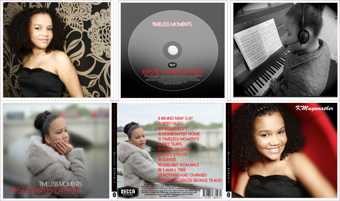
For the Spine I wanted to keep it simple and make it fit in well with the rest of the digipak by using colours that have been used throughout the digipak.
Spine Draft 1:

For the first draft I made the base colour black because if I wanted the spine to fit right in with the rest of the digipak then I had put the best base colour that can go well with the other colours used throughout the digipak. These colours being red and white.
 For the second draft I added the artist's name and the album name which was 'Kirstie Mayweather' and 'Timeless Moments'. I used the same font as the front and back cover for both names and I used the same colour that each name had on the front cover. So for 'Kirstie Mayweather' I used the colour red which proved to be a good choice because it shows the difference in the spine and the colour red separates the name in the colour white. The album name is in the colour white which again is used in the front cover and again it helps separate the names from each other. Also, with the black base you can see each name clearly. Furthermore, I wrote the names going down the spine instead of making it in side ways because from my research the artists wrote both names sideways but I challenged this convention because I believe for my digipak both names look better going down and it also looks more clearer to read and easier to read as you don't have to have turn the digipak flat in order to read both names.
Spine Final (Draft 3):
For the second draft I added the artist's name and the album name which was 'Kirstie Mayweather' and 'Timeless Moments'. I used the same font as the front and back cover for both names and I used the same colour that each name had on the front cover. So for 'Kirstie Mayweather' I used the colour red which proved to be a good choice because it shows the difference in the spine and the colour red separates the name in the colour white. The album name is in the colour white which again is used in the front cover and again it helps separate the names from each other. Also, with the black base you can see each name clearly. Furthermore, I wrote the names going down the spine instead of making it in side ways because from my research the artists wrote both names sideways but I challenged this convention because I believe for my digipak both names look better going down and it also looks more clearer to read and easier to read as you don't have to have turn the digipak flat in order to read both names.
Spine Final (Draft 3):

Spine Draft 1:

Spine Draft 2:
 For the second draft I added the artist's name and the album name which was 'Kirstie Mayweather' and 'Timeless Moments'. I used the same font as the front and back cover for both names and I used the same colour that each name had on the front cover. So for 'Kirstie Mayweather' I used the colour red which proved to be a good choice because it shows the difference in the spine and the colour red separates the name in the colour white. The album name is in the colour white which again is used in the front cover and again it helps separate the names from each other. Also, with the black base you can see each name clearly. Furthermore, I wrote the names going down the spine instead of making it in side ways because from my research the artists wrote both names sideways but I challenged this convention because I believe for my digipak both names look better going down and it also looks more clearer to read and easier to read as you don't have to have turn the digipak flat in order to read both names.
For the last draft and final spine I added the record label's logo because from my research I noticed that the convention used was to put the artist's record label on the spine so I used this convention and put my artist's record label on the spine because it does give it a more professional look and I felt like I was giving the spine its finishing touch by adding the logo.
Tuesday, 12 November 2013
Digipak - Extra Panel New

Extra Panel Draft 2:

Extra Panel Draft 3:

In the third draft, I changed the way I placed the photo of the artist because I didn't fill the whole Panel and I tried to extend the background but because of the red chair and our artists arm it was very difficult to extend, therefore, I had to re-size the photo by making it bigger in order to fill the frame. What I also did was position her more towards the left as I discovered before, it looks better on that side and because of the way the digipak will open as this is the left panel it would fit it in well with the rest of the digipak. I added the blur effect on the right side of the panel because I needed to add the signature of 'Kirstie Mayweather' and to see it clearly, I had to put the blur effect on. I placed the signature on the top right side of the image.

In the third draft, I changed the way I placed the photo of the artist because I didn't fill the whole Panel and I tried to extend the background but because of the red chair and our artists arm it was very difficult to extend, therefore, I had to re-size the photo by making it bigger in order to fill the frame. What I also did was position her more towards the left as I discovered before, it looks better on that side and because of the way the digipak will open as this is the left panel it would fit it in well with the rest of the digipak. I added the blur effect on the right side of the panel because I needed to add the signature of 'Kirstie Mayweather' and to see it clearly, I had to put the blur effect on. I placed the signature on the top right side of the image.
Extra Panel Final (Draft 4):

For the final draft I made the background from white to black because when I entered the signature of our artist the font was white and so was the background which meant you couldn't see the whole signature. So I changed the background colour which was better than changing the font to black because the background now goes which the rest of the digipak but also with the black dress used in the image. Having a white colour font for the signature on a background goes well together and I wanted to use more white in this digipak so this is why the colour was white.
For the final draft I made the background from white to black because when I entered the signature of our artist the font was white and so was the background which meant you couldn't see the whole signature. So I changed the background colour which was better than changing the font to black because the background now goes which the rest of the digipak but also with the black dress used in the image. Having a white colour font for the signature on a background goes well together and I wanted to use more white in this digipak so this is why the colour was white.
Digipak - Extra Panel
For the Extra Panel I used a image of the house with the sun shining in the middle and branches from a tree entering the frame because it is a well taken photo and because this is an extra panel so I thought an image of the sun shining can fit in well with the other pictures. This is because with the extra panel it can be anything that can link in with the rest of the pictures. So I put in this picture of the sun shining because it adds something different to the digipak because of the change in scenery. I wanted to add a unique feature in this digipak and thought this image would be perfect to demonstrate that.
Extra Panel Draft 1:

What I like most about this image is the red dots that that are reflected onto the camera because it gives the image a good effect, almost like a summer effect. Also the red dots link the image well with the rest of the digipak because of the fact of the red coloured writing used in the artist name in the front cover and the tracklist in the back cover.
Extra Panel Final (Draft 2):
.jpg)
This image looks the same as the draft 1 and for some reason it doesn't show how the image actually looks but on Adobe Photoshop it looks more smoother and you can see the trees in more detail to bring them out from white sky background.
Extra Panel Draft 1:

Extra Panel Final (Draft 2):
.jpg)
This image looks the same as the draft 1 and for some reason it doesn't show how the image actually looks but on Adobe Photoshop it looks more smoother and you can see the trees in more detail to bring them out from white sky background.
Monday, 11 November 2013
Digipak - Right Panel New
For the Right Panel I chose to put a photo of our artist 'Kirstie Mayweather' because this album is all about her and so I wanted more panels of her in different outfits rather than having the same outfit throughout the digipak. The reason for this is because in the inside panels it can show the artist in a different way such as in the panel she is represented as classy with the black and white effect and into her music with the piano and head gear. Also, because we wanted to represent our artist as 'classy' and 'sophisticated' I assumed this photo of her working in the studio would be good to use because in this photo she is in wearing casual clothes doing her job instead of what some of the other other photos showed which was being all dressed up and giving her audience a pose.

The first draft is the actual photo taken with no effect and this image had to be re-sized a little as it's a bit too wide for the square size panel.
Right Panel Draft 2:

Right Panel Draft 1:


For the second draft, the image has been resized to a square and I made the photo black and white because from my digipak research, 1 digipak had the black and white effect which looked effecting so I wanted to develop this convention by putting one image in the digipak black and white. The reason why I chose the image of her in the studio working instead of the, for example, the front cover was because this image proved to be most effective in black and white and because the main colours of the digipak was black, red and white, I knew it link in well with the rest of the digipak which benefited me as it was good and effective choice.
Right Panel Final (Draft 3):

In the final draft, I added another effect which was circle affect on all the edges. The effect makes the image focus more on the artist and the mise en scene because of the way it only allows the audience to see them only as the edges are blacked out. I used this effect because it adds a nice feature towards the digipak but also the image itself.

In the final draft, I added another effect which was circle affect on all the edges. The effect makes the image focus more on the artist and the mise en scene because of the way it only allows the audience to see them only as the edges are blacked out. I used this effect because it adds a nice feature towards the digipak but also the image itself.
Subscribe to:
Posts (Atom)